

RAINY DAY TOYS:
BRAND IDENTITY PRESENTATION
This presentation is a response to an RFP (Request for Proposal) for Rainy Day Toys, a fictional small business located in Madison, Wisconsin. Rainy Day Toys is a specialty toy store that sells only wooden toys and books geared toward toddlers. My solution was to create a vintage style that was a throwback to the time when wooden toys dominated the marketplace, with a modern twist.
The video presentation, which was limited to 3 minutes, is meant to emulate an in person presentation to the client.
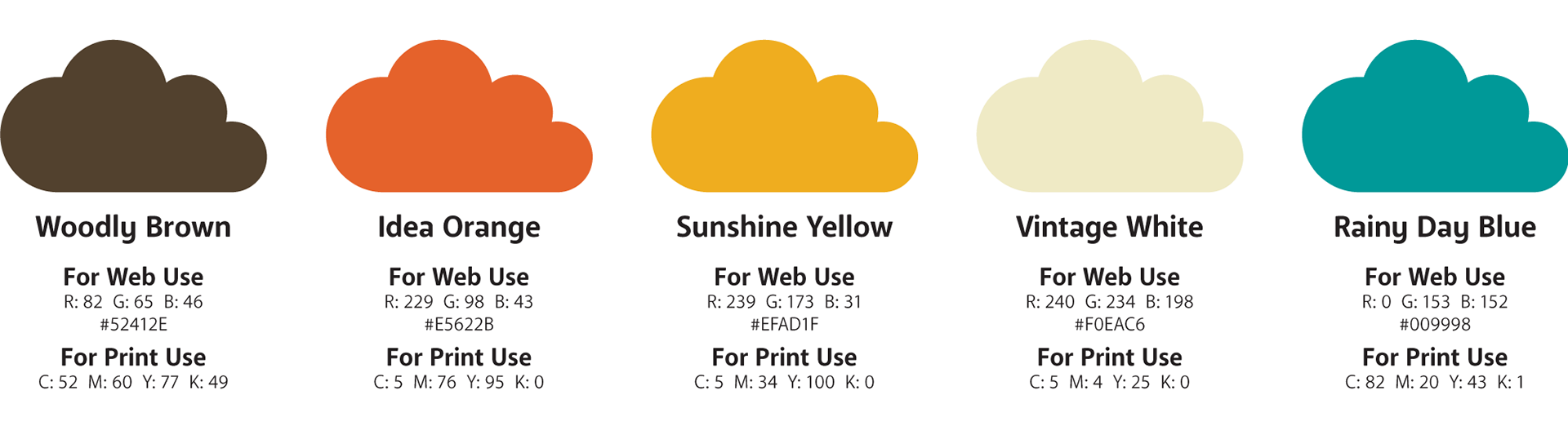
The color palette for Rainy Day Toys was specifically chosen homage to the colors of retro toy brands.
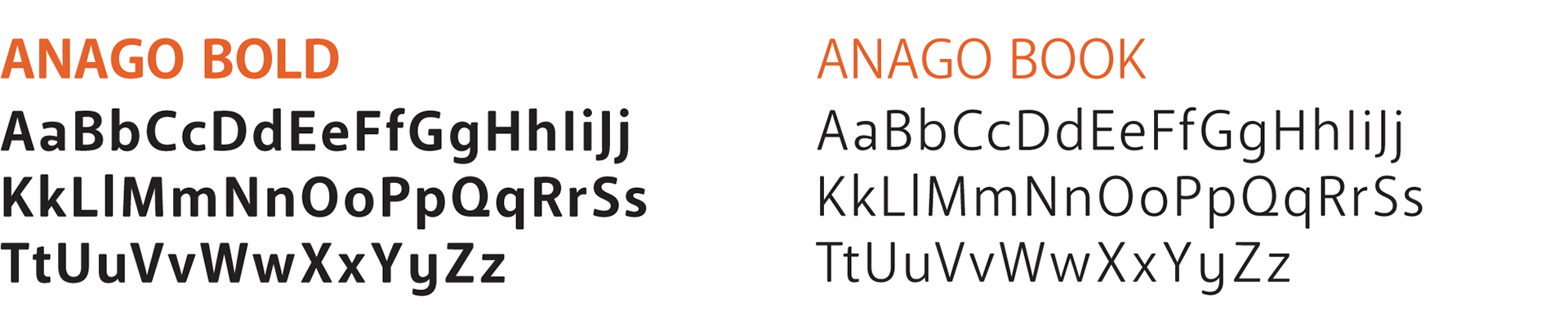
The type for Rainy Day Toys needed to be strong while also being soft and rounded to reflect the brand's safe an playful nature.
Anago Bold was chosen as the header type and Anago Book as the paragraph type for these reasons.
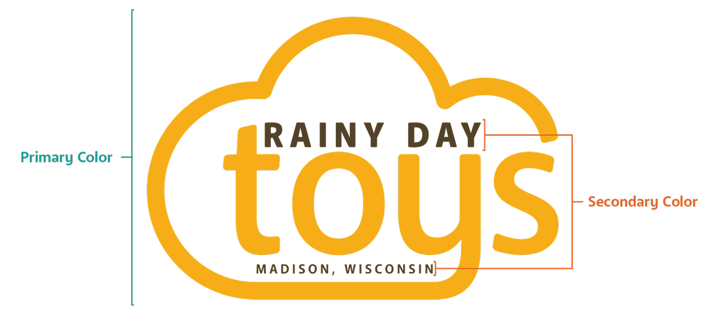
The Rainy Day Toys Logo was designed to be flexible and is divided into 2 distinct color sections, primary and secondary.
This allows the logo's color to work as a guidance device denoting a product's age group or category.
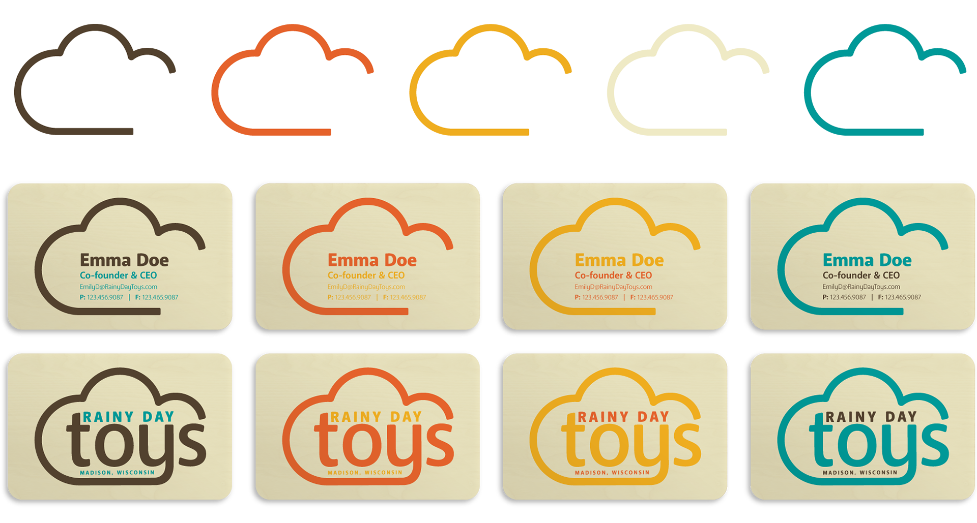
The cloud portion of the logo can be separated from the logo and used as a symbol for branding materials such as business cards.